CelinQ Insights · No. 70
Enterprise Architect Model Quality Score: Can CelinQ Measure Architecture Health?
A model quality score is only worth trusting if every point of it traces back to a specific, countable fact — arithmetic first, with AI reserved for explaining what the arithmetic already found.
"How healthy is our architecture repository" is a question governance boards ask constantly and answer badly, usually with an impression rather than a number. Someone who has spent years working in a model has a gut sense of whether it is in good shape — whether the packages are tidy, whether the naming feels consistent, whether things generally seem documented — and that gut sense is not worthless, but it is also not something you can put in a steering committee slide, defend to an auditor, or compare against the state of the model six months ago with any precision. It degrades the moment the person with that gut sense goes on leave, changes teams, or simply stops noticing the slow decay that happens gradually enough that nobody update-by-update perceives it.
A model quality score exists to replace that impression with something durable: a number, or a small set of numbers, computed the same way every time, from facts anyone can independently verify by looking at the model. Whether such a score is worth building depends entirely on whether it resists the two failure modes that make most "quality scores" untrustworthy in practice — vanity metrics that move when you tune the weights rather than when the model actually improves, and single numbers so aggregated that a genuine problem hides comfortably behind a healthy-looking average. Both are avoidable, but only if the score is built from the ground up as a set of specific, named, individually inspectable coverage measures rather than reached for as a single mysterious output.
Completeness score, ownership coverage, relationship coverage
The most fundamental measure is completeness: of the fields a governance process actually cares about for a given element type, how many are populated. An application element might have ten fields the organisation's modelling standard expects — name, description, owner, lifecycle status, technology tags, and so on — and completeness for that element is simply how many of the ten carry real values rather than defaults or blanks. Averaged across every in-scope element, completeness becomes a single, honestly computed percentage that moves in a way anyone can predict: fill in more fields correctly, the number goes up; leave more blank, it goes down. No interpretation is required to compute it, and none is required to understand what moving it means.
Ownership coverage narrows that same idea to the field organisations tend to treat as the minimum bar for accountability: what proportion of in-scope applications and systems carry a populated owner field. This is one of the clearest, highest-leverage numbers a governance function can track, because an ownerless application is not merely an incomplete record — it is a system nobody is accountable for noticing when something goes wrong with it, exactly the risk described in the piece on architecture smells. Relationship coverage does the equivalent work for structure rather than metadata: what proportion of elements that should, by the organisation's own modelling conventions, participate in at least one relationship of a defined kind actually do, which surfaces the orphaned and under-connected elements described in that same piece as a trend rather than a one-off finding.
Documentation coverage, duplicate detection, naming conformity
Documentation coverage measures the proportion of in-scope elements carrying a populated description or notes field of at least a minimal length, which sounds almost too simple to matter until you consider what it protects against: the slow accumulation of elements that exist, are connected correctly, and carry the right metadata fields, but that nobody could explain the purpose of without asking whoever happened to build them, who may well have left the organisation. Tracked as a coverage percentage over time, documentation coverage tends to be one of the more revealing numbers in a quality score, because it is exactly the field people skip under deadline pressure, and a steady decline in it is an early, cheap-to-fix warning that a repository's long-term usefulness is quietly eroding.
Duplicate detection contributes to a quality score differently, as a count rather than a coverage percentage: how many candidate duplicate pairs the deterministic signals described in the discussion of architecture smells — matching names, shared dependency sets, matching stereotypes over the same apparent capability — have surfaced and not yet been resolved. A rising count over successive scoring runs is a genuine early warning that a portfolio is drifting toward redundancy faster than it is being cleaned up, even before any individual pair has been confirmed as a true duplicate by a human reviewer. Naming conformity is a narrower, mechanical check against whatever naming convention an organisation has actually adopted — a prefix, a casing rule, a controlled vocabulary for element types — expressed as the proportion of elements whose name matches the pattern, catching the kind of drift that makes automated tooling, including the natural-language querying described elsewhere in this series, quietly less reliable the longer it goes unchecked.
Lifecycle completeness and architecture rule violations
Lifecycle completeness measures the proportion of in-scope elements carrying a current, populated lifecycle status, and it deserves its own line rather than folding into the general completeness score, because lifecycle data ages in a way most other fields do not: a status that was accurate a year ago can be quietly wrong today even though the field is technically "populated," if nothing updates it as the system moves through its actual lifecycle. A more rigorous version of this measure checks not just presence but staleness — how long since the status was last touched, compared against the organisation's own policy for how often it should be reviewed — which turns a binary presence check into something closer to a genuine freshness signal.
Architecture rule violations roll up the deterministic checks described in the piece on AI-assisted architecture review — cyclic dependencies, technology standards exceptions, security-relevant relationships lacking documented review — into a single count within the quality score, weighted by whatever severity classification that review process assigns. This is the measure most directly tied to structural risk rather than metadata hygiene, and it is usually the one a governance board cares about most once the score has been in use for a while, because it points straight at the findings that could plausibly cause an incident rather than merely an awkward audit conversation.
A single quality score that goes down tells you something is wrong. Only the coverage measures underneath it tell you what — and a score worth trusting is built so anyone can always get from the first to the second.
Combining measures without hiding the problem
The temptation, once several coverage measures exist, is to average them into one headline number an executive can glance at, and there is a real case for having such a number — a single trend line is easier to put in front of a steering committee than eight separate charts. But averaging is also exactly where a quality score can quietly stop being trustworthy, because a workspace with excellent documentation and catastrophic ownership coverage can average out to a perfectly respectable-looking score that hides the one problem that actually matters. The discipline that keeps a combined score honest is refusing to let it be the only number anyone sees: the headline figure is a weighted combination of the named measures underneath it, every one of those measures remains individually visible and individually trackable, and the weighting itself is a documented, adjustable policy rather than a black-box formula, so that a governance board can ask "why did the score drop" and get an answer that names the specific measure responsible, not a shrug.
This is the same principle that runs through every deterministic feature described across this series: a number is only as useful as its traceability back to the facts that produced it. A quality score that cannot explain its own movement in terms of which coverage measure changed is not meaningfully different from the gut-feeling impression it was supposed to replace — it has just made the impression harder to argue with, which is a worse outcome, not a better one.
Trend over time
A single snapshot of a quality score answers a much less useful question than its trend does. Ninety per cent ownership coverage sounds fine in isolation and alarming if it was ninety-eight per cent three months ago, because the second number tells you something the first cannot: coverage is actively eroding, probably because whatever process used to enforce it during project delivery has quietly stopped being followed, and the erosion will keep compounding unless something changes. Tracking each coverage measure and the combined score across successive computations — weekly, monthly, or aligned to a release cadence, whatever fits the organisation's own review rhythm — turns the score from a report card into an instrument, the kind of thing a governance function actually watches rather than merely files.
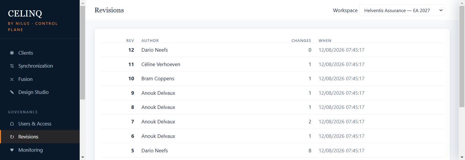
This is where the score benefits directly from infrastructure the platform already has for an unrelated reason: every change that flows through a workspace is recorded in CelinQ's ordered revision history, which means a quality score computed against the model state at any past revision is a genuine recomputation against data actually captured at that point in time, rather than a guess reconstructed from memory. The same revisions view used to audit who changed what and when, shown in the Control Plane's ordered list of author, change count, and timestamp per revision, is what makes a trustworthy trend line possible in the first place, rather than a score whose history is itself just another unverifiable claim.
Workspace comparison
An organisation running several workspaces — different teams, programmes, or client engagements for a consultancy modelling on behalf of several public bodies — gains something a single workspace's trend line cannot offer on its own: a basis for comparison. If every workspace's quality score is computed by the same methodology, with the same named coverage measures and the same documented weighting, then a score of seventy in one workspace and ninety in another becomes a genuine, comparable signal about which team's repository needs governance attention first, not a matter of taste or house style, and it turns architecture quality from an anecdotal reputation ("that team's models are always a mess") into something a portfolio owner can actually act on with evidence.
The caveat that makes this comparison fair rather than misleading is scope discipline, echoing the scope discussion in the piece on architecture review: comparing a workspace holding a mature, decade-old production landscape against one holding a three-month-old greenfield project on the same absolute scale will always make the newer, smaller workspace look artificially healthier, simply because it has had less time to accumulate the kind of decay a completeness or documentation measure is designed to catch. A fair comparison either normalises for scope and maturity or, more simply, compares each workspace's own trend against its own history rather than against another workspace's absolute number — the trend line is the more honest unit of comparison in almost every case.
Quality score without AI
Every measure described so far — completeness, ownership, relationship, and documentation coverage, duplicate candidates, naming conformity, lifecycle freshness, rule violations, the trend, the cross-workspace comparison — is arithmetic and rule evaluation against the canonical model, computed by the same deterministic layer discussed at length in the piece on private, AI-free model analysis. None of it requires AI to be enabled anywhere in a workspace, and none of it changes if AI is switched off entirely, because a quality score built this way was never architected on top of an AI layer in the first place. An organisation running under sovereign mode, with external AI blocked at the configuration level and unable to be re-enabled from the console, can compute, track, and compare quality scores exactly as completely as an organisation running with every AI capability opted in.
This matters for the same reason it matters throughout this series: a quality score is exactly the kind of number a governance function needs to defend to an auditor or a security reviewer, and "the number comes from a rule anyone can inspect" is a defensible answer in a way "the number came from a language model's assessment" is not. Keeping the score deterministic is the property that makes it usable for the governance purpose it exists to serve, not a limitation imposed reluctantly.
Optional AI explanation layer
Where an optional AI layer earns a place, once an administrator has deliberately enabled it, is in explaining a score's movement in language a non-specialist stakeholder can absorb quickly — a short paragraph noting that the quarter's drop was driven mainly by declining ownership coverage in one particular package cluster, phrased for a steering committee rather than presented as a table of coverage percentages they would have to interpret themselves. As with every other AI-assisted feature described across this series, the explanation is generated strictly from the coverage measures and their traceable underlying facts that were already computed deterministically; the AI is never asked to assess the model's quality itself, only to narrate a result that already exists and can be independently verified. The explanation is presented clearly as generated commentary, never as an additional, unverifiable input to the score.
This keeps faith with the pipeline that governs AI everywhere in CelinQ: the deterministic layer produces the fact, an optional and explicitly enabled AI advisor may explain the fact in plain language, and a human remains the one who decides what, if anything, the fact should change about how the organisation runs its architecture practice. The core of the platform — including every coverage measure and the combined score itself — works identically whether that explanation layer is present or absent.
A quality score's job is not to feel impressively intelligent. Its job is to be believed by an auditor who has never seen the model and trusted by an architect who has seen every element of it — and only a number built from named, inspectable facts earns both.
A worked example: a quarter of declining coverage
Numbers are easiest to trust when you can watch them move for a reason, so consider how this might play out over a single reporting quarter for a workspace holding a mid-sized public-sector portfolio. At the start of the quarter the combined quality score sits at eighty-four, comfortably in the range the governance board has learned to read as healthy, with ownership coverage at ninety-six per cent, documentation coverage at seventy-one, and two open architecture rule violations, both already tracked and scheduled for remediation. Nobody in the room is worried about the repository, and on the numbers available, nobody needs to be.
Eight weeks later, the scheduled recomputation shows the combined score has dropped to seventy-six. The instinctive reaction in a governance meeting confronted with a headline number like that is to ask what went wrong across the board, and this is exactly the moment the discipline of keeping every underlying measure individually visible pays for itself, because the answer is not "everything got a little worse." Ownership coverage has barely moved, down half a point. Documentation coverage has fallen sharply, to fifty-eight, and the architecture rule violation count has risen from two to nine. Two numbers moved; six did not. A score that only reported the combined seventy-six would have left the board debating a vague sense of decline; the named measures underneath it point straight at the two things actually worth an agenda item.
Tracing the documentation drop back through the revision history that makes the trend line trustworthy in the first place reveals a specific, fixable cause: a delivery team onboarded twenty-three new integration components during a rapid platform rollout in the middle of the quarter, and the delivery process they followed evidently never enforced a documentation step the way the organisation's older, more mature project templates used to. The rule violation increase traces to the same rollout — seven of the nine open violations involve technology tags on those same twenty-three components that were never checked against the organisation's approved standards list before go-live. Both findings point at the same root cause: a newer delivery pathway that skipped governance steps the workspace's quality score was quietly built to catch. The remediation the board actually agrees to is not "fix the documentation," which would treat the symptom, but "add a documentation and standards gate to the new rollout process before the next release," which addresses the reason the numbers moved in the first place.
This is the version of "measuring architecture health" that actually changes how an organisation runs, and it only works because the score was decomposed honestly rather than presented as one abstract figure a board could nod at and move past. A single combined number told the board that something needed attention. The named coverage measures underneath it, tracked against a trustworthy history, told them exactly what and why — and that second part is the difference between a metric that gets glanced at once a quarter and one that actually changes a delivery process.
Honest limits
A quality score, however carefully built, measures what it was designed to measure and nothing more, and it is worth naming the gap plainly. Completeness, ownership, and documentation coverage all measure whether fields are populated, not whether what was written in them is actually correct or useful — an element can carry a beautifully complete, entirely wrong description, and the score has no way to know the difference, because judging correctness of content is exactly the kind of open-ended interpretation this whole series has argued does not belong in a deterministic layer. Naming conformity catches pattern violations, not whether the pattern itself is still the right one for how the organisation actually models today. And no coverage measure, however cleverly combined, substitutes for an architect's own periodic, close reading of the repository, which remains the only way to catch the kind of problem that has nothing to do with missing fields or broken thresholds and everything to do with a design decision that was, in hindsight, simply wrong.
What a well-built quality score does deliver, reliably, is an end to governance by impression: a number that moves for reasons anyone can name, that compares fairly across time and across workspaces when scope is handled honestly, and that keeps working exactly the same whether an organisation has AI switched on, switched off, or blocked entirely under sovereign mode. For a governance function that has spent years defending gut feelings about architecture health to sceptical auditors, that is not a small thing to be able to say.
Recognise this in your own team? Get in touch — we’re happy to talk through whether CelinQ fits, no pressure either way.